4. The Big Short
Book Jacket & Website Design
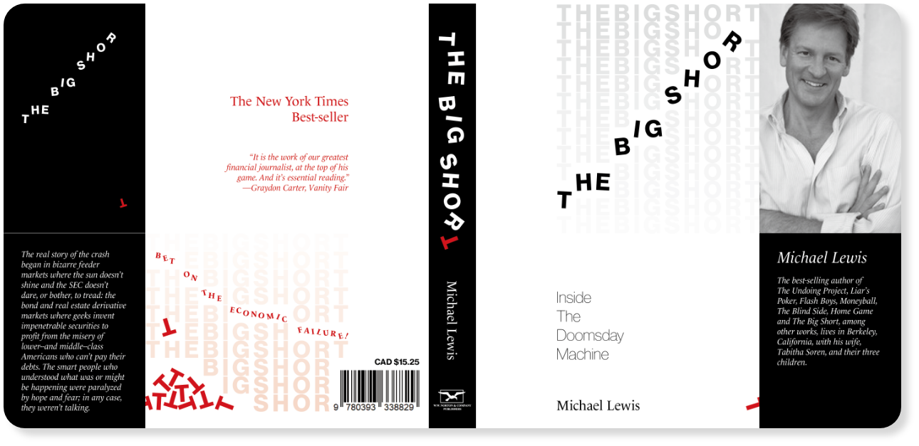
Design Rationale-Book Jacket
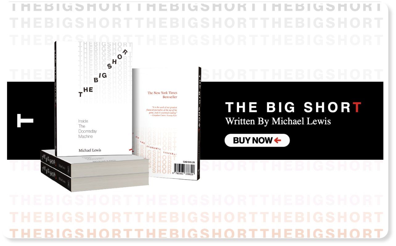
“The Big Short” by Michael Lewis
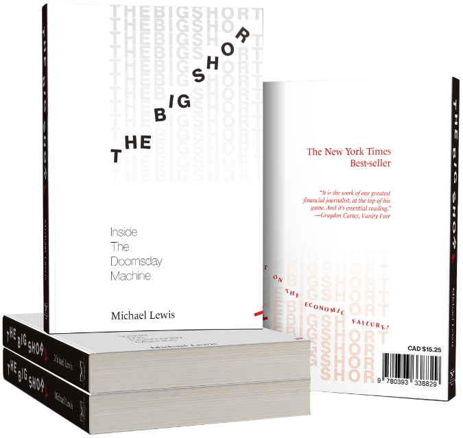
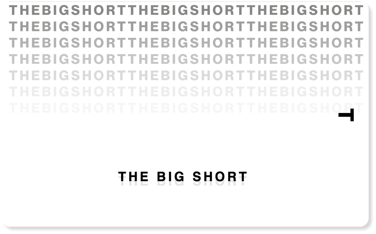
This book is an economic novel set in a true story. The neatly arranged texts are implying buildings in a city or information in a chart. So readers can guess it will be a serious and complex story.
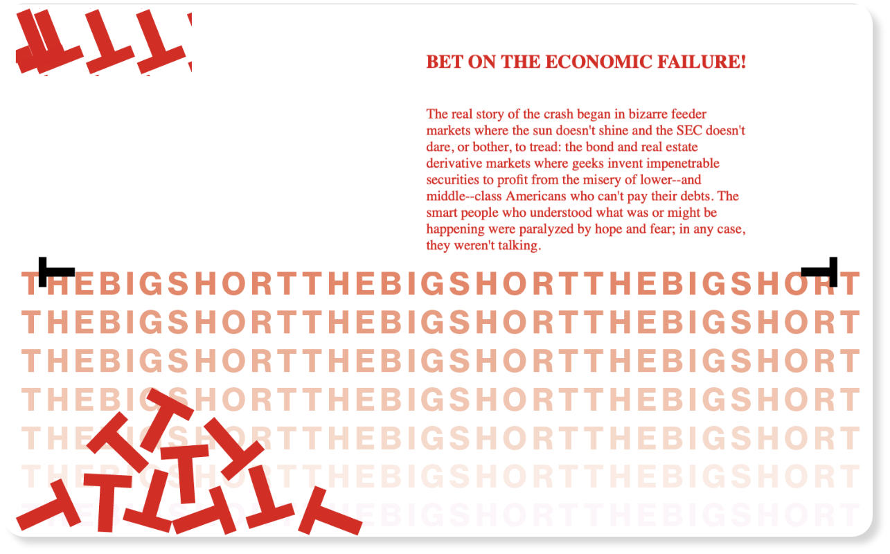
The book focuses on the person who gets huge profits with sharp insights during the economic crisis caused by subprime mortgages. In the book, the majority of people, such as the government, banks, citizens, repeat loans and investments without any sense of crisis. They are just dreaming of an optimistic future and rejoicing in unprecedented economic growth. However, in reality, the economic systems are unstable and in danger. The rising and shaking title implied that fall is just around the corner.
Since many economic jargons are used in this book, the target readers are the people who have some background knowledge of the economy. Therefore, they would already know that blue means loss and fall, and red means gain and rise in the economy.
Then, why did the various red colors used in fallen letters or falling charts? From the point of view of the main character, who made a huge profit from boldly betting on the collapse of the market, the decline means gain to him.